
Action Against Hunger
Nonprofit | Desktop Website
Project Overview:
My team of three and I redesigned Action Against Hunger’s (AAH) website to address the challenge of attracting more donations. We followed the double diamond design process to develop a user-centered design solution to attract and maintain donors.
What is Action Against Hunger?
AAH is a global humanitarian organization that fights the pervasive hunger crisis. Their mission is to save the lives and communities of those devastated by natural disasters, poverty and other causes by providing resources for survival.
The Challenge:
The overarching issue of attracting more donations can be broken down into these smaller challenges:
-
Increase monthly donations from new and existing donors
-
Elevate the awareness of AAH’s other programs, while maintaining the visibility of their 1-time donations
-
Showcase the positive impact of these donations to encourage users to donate more
The Solution:
A website redesign to inform users about the hunger crisis and gain the trust of users to donate to AAH. Through the added features on the website, users can build an emotional connection to the programs of their interest.
Role: UX Researcher & Designer
Timeline: 2 weeks
Deliverables: UX audit | C&C analysis | User persona | Journey Map | User flows | Sitemap | Sketches & Wireframes | Mid & High fidelity prototypes
Tools: Figma, Miro, Google Workspace

The Research Process
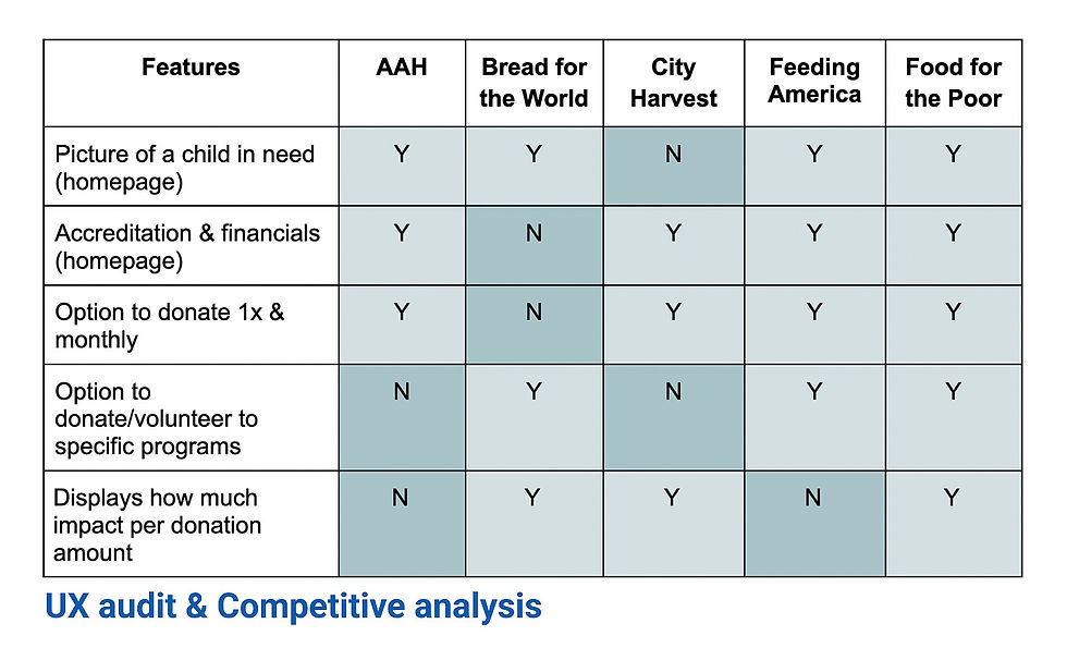
UX audit & Competitive analysis
Key takeaways:
-
For empathy/sympathy, a picture of child is used on the homepage.
-
For transparency, ratings & financials are on the homepage.
-
To inform & encourage bigger donations, impact per donation amount is shown during donation - the bigger the donation, the bigger the impact.
-
To build a connection to a cause, users can choose the donation frequency & programs their interest.
The root of AAH’s challenges was the need for more donations from new and existing donors. Therefore, my team and I did a UX audit to learn about our website. Also, it was important to familiarize ourselves with the tactics that other hunger relief organizations used to attract donors, so we did a C&C analysis to see our competitors’ approach.


Usability Tests
From the UX audit, we could see the potential pain points of the current AAH website and so we sought out to test those assumptions by doing usability tests.
.png)
.png)
-
66.7% of users felt the website appeared to be a “typical” charity
-
66.7% of users found it hard to find information because of its vast content
-
66.7% of users found the top navigation categories unclear
.png)
-
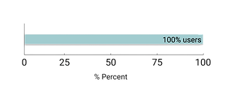
100% of users failed at finding “financials” on the landing page
User Surveys
Now that we had information on the technical aspects of the website, we needed to learn user behaviors for donating to nonprofits. We learned that:

-
98% of users have made 1x donations to an organization before
-
only 14.6% of users donate monthly to an organization
User Interviews
We needed to find out why there was such a stark discrepancy between 1x donations and monthly donations. We had to learn the thought processes and emotions that went into making a donation, and how users felt about the hunger crisis. With our 5 user interviews, we were able to gather these insights.
 Users learned about causes through social media & word of mouth. |  Users were unaware of the gravity of the hunger crisis because it is not broadcast in the news or social media. |
|---|---|
 Users did not trust that their money was going to those in need - bigger the organization, worse their distrust. |  Users only donated when they felt an emotional connection to the cause. |
 Users don't like constant donation requests after they've donated. |  Users felt a sense of accomplishment after they donated. |
User Persona
We synthesized our research and created our persona, Laura, a busy ER nurse whose passion for helping others not only translated into her career, but also her personal missions. She was the culmination of all of our users' thoughts and behaviors.

Journey Map
Here we go, on Laura’s journey of first finding out about AAH through a friend, all the way to the time after she makes a one-time donation. We highlight her pain points with her initial lackluster impression of AAH, disappointment in not knowing about the hunger crisis, and her distrust with AAH. Then we get to see that despite her reservations, as she explores the website she feels motivated and feels great after making a contribution. However as time passes, her motivation and connection to the cause rapidly declines.
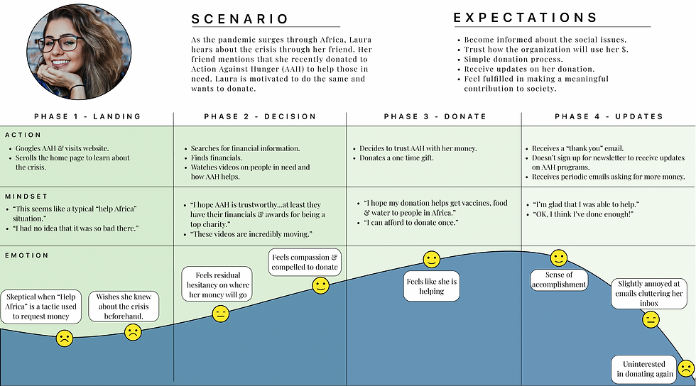
Problem Statement
From our persona and journey map, we proceeded onto a problem statement that addressed Laura’s pain points and the consequences that resulted from them. We decided on:
Laura needs to build an informed connection with AAH because the lack of awareness prevents her from donating consistently.
Ideate
-
HMW make it clear that AAH is trustworthy?
-
HMW increase awareness and visibility of AAH & its programs?
-
HMW build a stronger emotional connection to AAH?
-
HMW continue to promote 1x donations?
-
HMW maintain consistent donors?
-
HMW make people feel accomplished every month?
From our problem statement, we began drafting up “How might we” (HMW) statements to get the ball rolling on ideas for possible design solutions. After 3 rounds of revisions, we finally came up with:
Design Principles
We kept in mind our challenge of finding a way to increase donations whilst addressing our HMW statements, and we came up with these design principles as a foundation for our design solution: transparency, visibility of impact, and building a connection.
 Transparency: gain the trust of users so they're comfortable with donating their money. |  Visibility on impact: inform users on where their money is going & help users feel a sense of accomplishment |
|---|---|
 Build a connection: help users stay informed & engaged with AAH and prompt consistent donations |
Since we knew that the website had issues based on our usability tests, we agreed that a website redesign was the way to go. So, with the design principles in mind, we discussed the type of features we would need to implement into our new website.
-
Transparency: Visible ratings and financials & mission statement on the homepage -- users had trouble finding this on our usability test
-
Visibility of impact: impact info during donation -- not present in the current website
-
Building a connection: user can set up an account to see all their donations, receive updates, customize their newsfeed -- brand new feature
The Design Process
User Flow
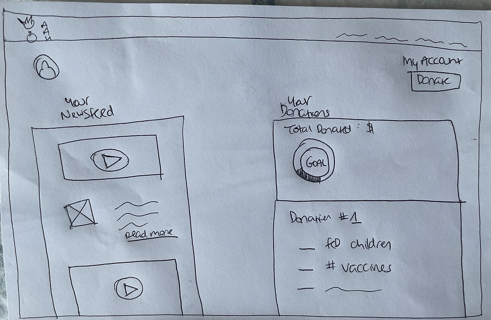
For the new feature of creating an account, we created a user flow for "sign up." We wanted users to be able to customize what they wanted to see on their account by allowing them to select which programs and countries they wanted to see on their personalized newsfeed.

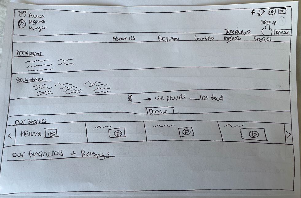
Site Map
From our research, we knew that the information architecture had to be changed as users found the top navigation categories confusing. We wanted unambiguous categories that were intuitive for users to know where to go for specific information. Additionally, the top navigation was where we wanted to address the challenge of increasing the visibility of all of AAH’s programs.

Sketches & Wireframes
From our user flow, we began sketching out frames for the account sign up. From the homepage, users can sign up using a link on the header, fill out personal information and then start filling out their newsfeed preferences to start building their connection to AAH. Finally, on their account page, users could see a personalized newsfeed and a list of their donations.

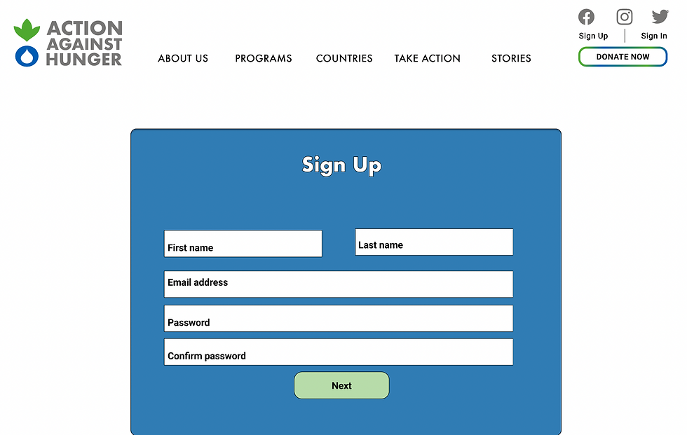
Mid-Fi Iteration
From our sketches, we digitized them on Figma to create a mid-fi prototype. The sign up flow is shown below. There were some changes made from the sketches, some of which include, an added security check and selecting areas of the world, instead of individual countries.


MVP Features
From our mid-fi prototype, we iterated on our features that were created from our design principles of transparency, visibility of impact, and building a connection.
Transparency
.png)
.png)
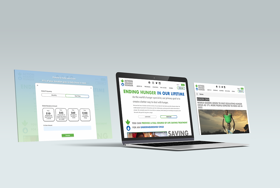
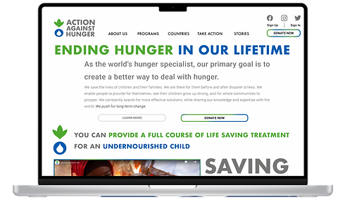
Homepage:
-
Clear mission statement so users know what AAH is about
Homepage:
-
Visible ratings & financials so users where their money is going
-
Informing users exactly how much money is needed to save a life
.png)
.png)
Visibility of Impact
Donation:
-
Informs users how much impact per donation amount
-
Informs users that 91% of their donation goes to the cause
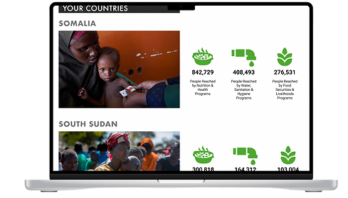
Account page:
-
Users can see the impact on the specific programs & countries they donate to
Build a connection
.png)
.png)
Account page:
-
Users have a personalized newsfeed of the specific programs & countries that they selected during "sign up"
Stories (top navigation):
-
Users can filter out the stories that interest them, making it more digestible & easier to find, instead of going through 147 pages of stories on their current website
.png)
Programs (top navigation):
-
Users can donate to specific programs of their interest instead of donating to one main cause

Donations:
-
Users can spread awareness on social media, allowing others to learn and build a connection with AAH
Usability Test on MVP
From our MVP, we had to understand how users experienced our product and to find any potential pain points. We performed 4 usability tests.
.png)
-
100% of users found the website to be easy & streamlined
-
100% of users successfully found all of AAH's programs
.png)
.png)
-
50% of users failed at finding the "sign up" button on the header
Analysis: top right portion of the header is too cluttered, making it hard for users to find the "sign up" prompt
.png)
-
75% of users successfully found AAH's ratings & financials
Final Prototype
Based on our usability tests, we knew that we had to iterate on our design. We made a few UI changes to make our MVP more aesthetically pleasing. Most importantly, since 50% of users had issues signing up, we made "sign up" more noticeable on the header (shown below).
(previous iteration)
.png)
.png)
(final prototype)
Next Steps

1. Test out this iteration with usability tests.

2. Rollout the website with the new features to see if more donations come in.

3. Redesign the homepage
to lessen the cognitive load.

4. Continue the fight against
world hunger!
Final Thoughts
Since non-profits need donations to fight for their mission, we solely relied on our research to teach us what the users wanted out of our website and this guided us the entire way. After much discussing, we knew that we had to implement new features onto our website to help stand out against its competitors -- of course, within the confines of what we learned about our users.
Given that we worked as a team, it was only natural that there would be some differing opinions at some point along the way. I helped anchor our team back by using our research to keep us on track. Ultimately, collaboration was key to creating a cohesive redesign with dynamic ideas and I used our user research to keep us grounded.
